Row Content
The RowContent widget arranges child widgets horizontally within a row, using a 12-unit grid system for responsive layout. It automatically expands to fill the width of its parent container.
Widget Type
The Type property defines the visual presentation and behavior:
Field: Represents a single field within a form, suitable for individual data entry elements. Occupies a smaller space.Section: Represents a section within a form, grouping related fields. Occupies a larger space and is visually distinct. Sections support expand/collapse functionality.
Label
A label can be added using the Label property to provide a title for the RowContent. The label is displayed above the row content. If no label is specified, no label is displayed.
Columns and Grid Layout
RowContent uses a CSS-based 12-unit grid system. Each column's Width property specifies how many units it occupies ( e.g., a Width of 6 occupies half the row's width). Columns exceeding the available width will wrap to the next line.
Styling
The appearance of the RowContent widget can be customized using styling properties (background color, text color, font style—bold, italic). These styles can be overridden using formatting rules based on specific conditions.
Responsive Layout
Column widths can be tailored for different screen sizes (small, medium, large). The default width applies to medium screens. Widths for other screen sizes are set independently; if not specified, a screen size inherits the width from the next smaller size. To hide a column on a specific device type, set its width to 0 for that size.
Fit Height
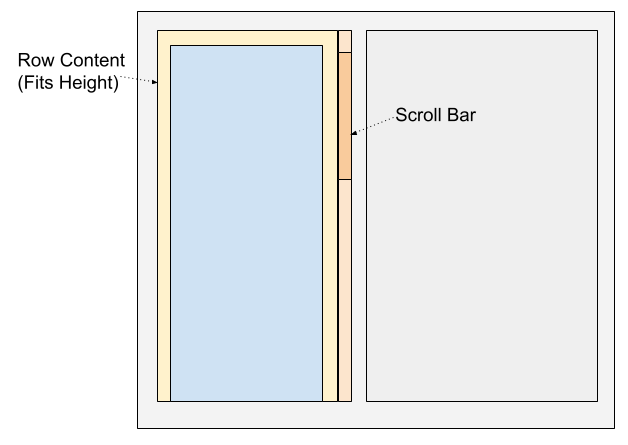
By default, the RowContent height adjusts dynamically to accommodate its children. To fix the height, set FitHeight to true. If the content exceeds the fixed height, a vertical scrollbar will appear.
XML Fields
XPathestablishes the data context used by the row and its child columns.TypeselectsFieldorSection;CollapsingselectsNone,Expanded, orCollapsedfor the initial section state.FitHeightcontrols fixed-height behavior.Label/Contentsupplies the optional row title.Stylecontains the row presentation settings.- Each
Columns/Columndefines a responsive grid area.XPathestablishes its data context;HtmlClassidentifies its presentation;WidthXS,WidthSM,WidthMD, andWidthLGset its width at the respective screen sizes;Alignsets content alignment. Controlscontains the widgets rendered in that column.Rulescontains rules applied to the row.
The row is a layout container. Its own XPath and each column's XPath only establish context for their child widgets; neither creates an input by itself.
Example
Row content with a single column.
1 2 3 4 5 6 7 8 9 10 11 | |
Related Pages
Example
Row content with two columns with 6-unit width each.
1 2 3 4 5 6 7 8 9 10 11 12 13 14 | |